
Join Our Newsletter for Cozy Home Inspiration, Family Fun, and Delicious Recipes Every Week
Popular Kitchen Cabinet Colors Ideas Worth Considering Before You Commit to White Again

Disclaimer. Some images featured in this post may originate from third-party sources and are used for illustrative purposes only. Please review our Image Credits Policy for attribution information.
I stood in the paint aisle holding four different swatches of the same shade of white, convinced one of them had to be wrong even though they all looked identical under the store lighting. Kitchen cabinet color decisions had been paralyzing me for weeks before that trip.
We had lived with builder-grade oak cabinets for years, always meaning to update them and never quite committing to a direction. Every time I sat down to choose a color, I froze somewhere between safe and interesting.
I remember standing in that aisle a little too long, holding swatches that all blurred together, feeling further from a decision than when I walked in. That frustration finally pushed me to stop guessing and start actually looking at real kitchens.
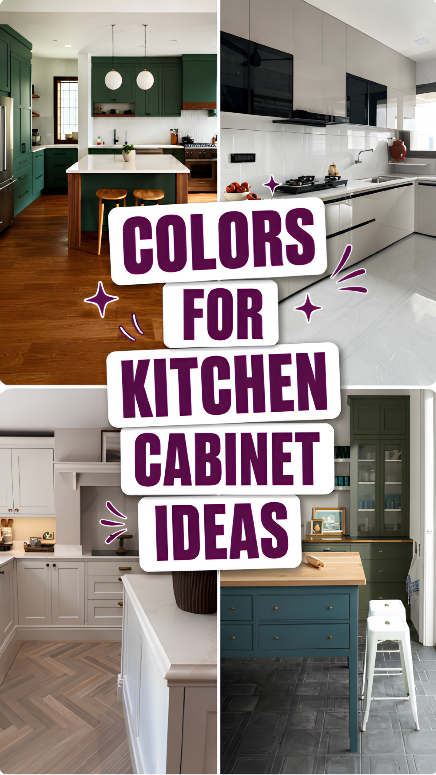
I spent that whole evening scrolling through kitchen photos instead of paint chips, and the shift helped almost immediately. Seeing a color on an actual cabinet, in real light, told me more than any swatch ever could.
Deep green, warm cream, moody black, even a bold red island—every option looked completely different once I saw it living in someone’s actual kitchen. That context is what swatches alone never manage to capture.
I started saving the photos that made me stop scrolling, the ones where I could picture our own cabinets that color without much effort. That instinct became the only filter that actually worked for me.
I tried a small sample on our own cabinets before committing to anything, painting just one door first. Watching how the color shifted from morning light to evening lamplight told me everything the store lighting could not.
Over the following weeks, I narrowed down what worked in our kitchen specifically, not just what looked good on someone else’s. Some colors that photographed beautifully online looked completely wrong once painted onto our own doors.
What surprised me most was how much a confident cabinet color changed the whole feel of cooking dinner every night. It stopped being a kitchen I tolerated and became one I actually wanted to stand in.
I am sharing the six kitchen cabinet color ideas that helped me finally commit to a direction. Everyone came from a real kitchen I admired online before I ever tested a sample on my own cabinets.
What We're Exploring
- 01 A Deep Green Kitchen Cabinet Feels Bold Without Turning Trendy
- 02 A Warm Kitchen Cabinet Pairs Beautifully With Natural Stone
- 03 Mom Notes
- 04 A Glossy Neutral Kitchen Cabinet Feels Sleek and Easy to Clean
- 05 A Soft Cream Kitchen Cabinet With Fireplace Style Detail Feels Timeless
- 06 A Bold Red Kitchen Cabinet Island Anchors an All Neutral Space
- 07 A Layered Green and Blue Kitchen Cabinet Combination Feels Collected
- 08 What Choosing a Kitchen Cabinet Color Taught Me About Trusting My Own Eye
A Deep Green Kitchen Cabinet Feels Bold Without Turning Trendy
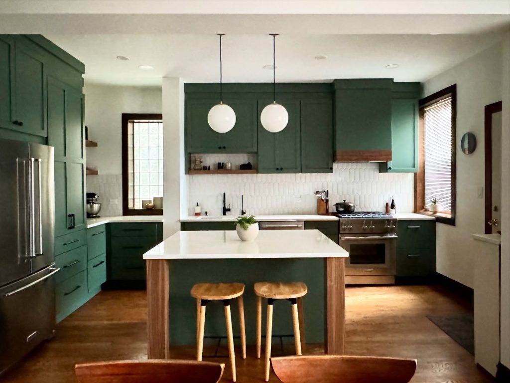
A rich forest green kitchen cabinet color reads as confident and grounded in a way that lighter, trendier shades rarely achieve. Paired with warm wood accents and brass hardware, it feels collected rather than like a passing fad. This kind of deep, saturated color works especially well in a kitchen with plenty of natural light to balance it.
White globe pendant lights and a light quartz countertop keep the green from feeling heavy or closing in the room. That contrast between dark cabinetry and bright surfaces is a favorite approach in modern kitchen design that leans bold without sacrificing brightness. A honeycomb tile backsplash adds texture without competing with the cabinet color itself.
Budget Note: Cabinet-grade paint in a deep green shade typically runs $50 to $70 per gallon at Sherwin-Williams, with brass hardware adding $5 to $15 per pull.
A Warm Kitchen Cabinet Pairs Beautifully With Natural Stone
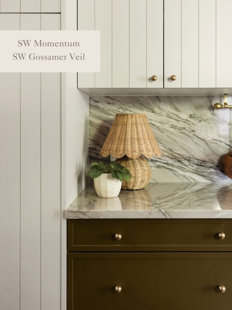
An earthy olive kitchen cabinet shade brings warmth that a cooler sage or true green can sometimes lack. Paired with veined marble countertops and antique brass knobs, it reads as collected and a little vintage rather than freshly trendy. This kind of muted, warm tone suits a kitchen aiming for nancy meyers decorating style comfort over stark minimalism.
Keeping the upper cabinets a soft cream while the lower cabinets carry the olive tone creates a natural visual break that keeps the whole kitchen from feeling too heavy. That layered approach lets one bold shade anchor the room without overwhelming it. A woven rattan lamp adds texture that softens all the hard stone surfaces nearby.
Budget Note: Two-tone cabinet paint typically runs $50 to $80 per gallon per color at Benjamin Moore, with brass cabinet knobs adding $6 to $18 each.
Mom Notes
Always test a paint sample directly on your own cabinets before committing to a full gallon. Lighting changes everything, and a color that looks perfect on a store swatch can shift completely under your kitchen’s actual windows and fixtures. Live with the sample for at least a few days before deciding.
A Glossy Neutral Kitchen Cabinet Feels Sleek and Easy to Clean
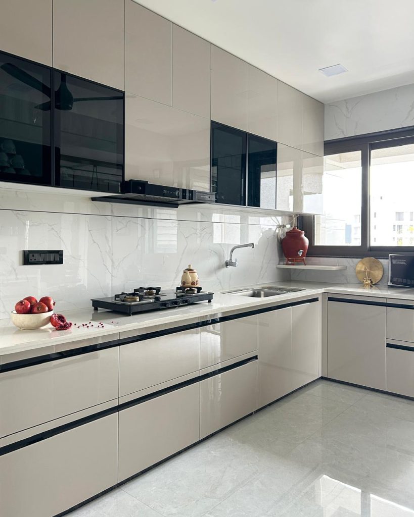
A high-gloss neutral kitchen cabinet finish reflects light in a way matte paint never can, making even a windowless kitchen feel brighter throughout the day. Paired with a marble-look backsplash and black glass upper doors, the whole look feels sleek and current. This finish suits a home leaning toward organic modern kitchen style over traditional shaker cabinetry.
The glossy surface also happens to be one of the easiest finishes to wipe clean, which matters a great deal for anyone cooking daily with kids running through the kitchen. Fingerprints and splatters lift off far more easily than they would on a textured or matte surface. That practicality is a real selling point beyond the visual appeal.
Budget Note: High gloss cabinet refacing or paneling typically runs $80 to $150 per linear foot through a kitchen remodeling contractor.
A Soft Cream Kitchen Cabinet With Fireplace Style Detail Feels Timeless
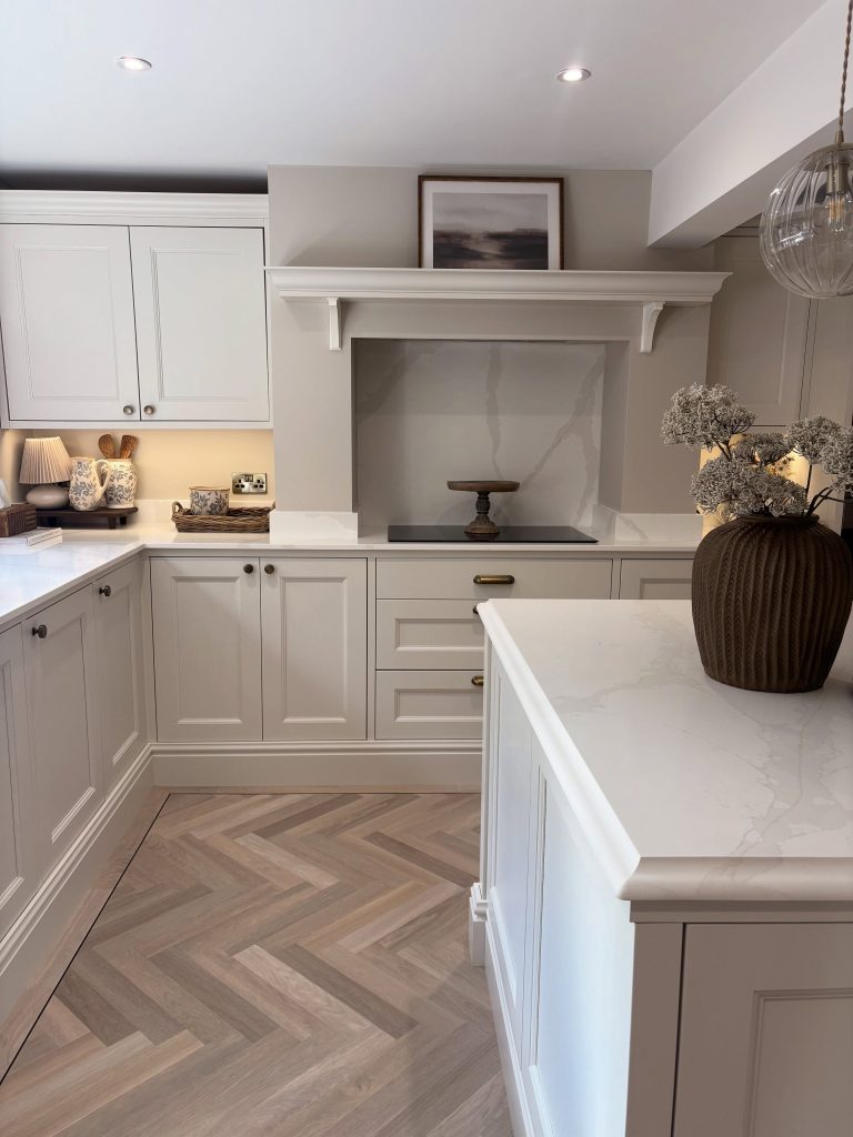
A soft cream kitchen cabinet color paired with a fireplace-style cooking nook and herringbone flooring creates a look that feels timeless rather than tied to any single trend. The warm, muted shade works with almost any countertop or hardware finish, which matters for anyone planning to update pieces gradually. This is a favorite starting point for a classic farmhouse pantry aesthetic.
Brass hardware and a dried floral arrangement soften the crisp cabinet lines without adding visual clutter. That restraint keeps a traditional kitchen from feeling overly formal or fussy. Herringbone patterned flooring beneath adds movement and texture that plain planks alone would not provide.
This color choice also holds resale value particularly well, since neutral tones appeal to a wider range of buyers than bold statement colors ever could. It is a practical choice for anyone updating a kitchen with an eventual sale in mind. That broad appeal is worth factoring into any long-term renovation plan.
Budget Note: Cream cabinet-grade paint typically runs $45 to $65 per gallon at Benjamin Moore, with brass cabinet pulls adding $8 to $20 each.
A Bold Red Kitchen Cabinet Island Anchors an All Neutral Space
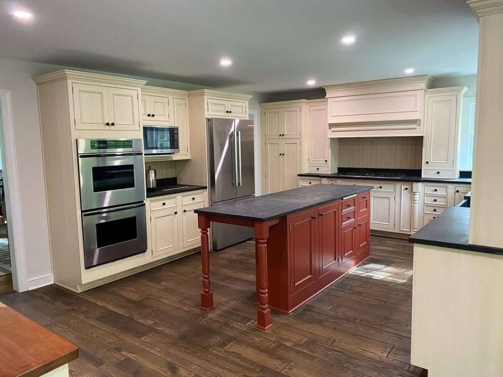
Painting just the island a bold red while keeping the surrounding kitchen cabinet perimeter a soft cream creates a single confident focal point without overwhelming the whole room. It proves that one bold color choice can carry an entire kitchen when the rest of the palette stays neutral. That contrast is what makes this approach feel intentional rather than accidental.
Turned wood legs on the island add a furniture-like quality that a flat panel base never quite achieves. That detail elevates the red from a simple paint choice into a genuine design feature. Dark countertops on the island further separate it visually from the lighter surrounding cabinetry.
Budget Note: Cabinet-grade red paint for a single island typically runs $40 to $60 per gallon, with turned wood island legs adding $30 to $60 each at a woodworking supplier.
A Layered Green and Blue Kitchen Cabinet Combination Feels Collected
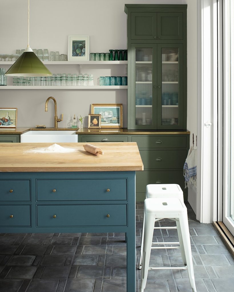
Pairing a deep teal blue island with olive green surrounding cabinetry creates a kitchen cabinet combination that feels collected over time rather than chosen from a single paint chip display. The two related but distinct colors work together the way a well-curated wardrobe does, complementary without matching exactly. This layered approach suits a kitchen aiming for a green black kitchen depth without going fully monochrome.
Open shelving styled with glassware between the two cabinet colors gives the eye a place to rest and breaks up what could otherwise feel like too much saturated color. A brass gooseneck faucet ties both cabinet tones together with a shared warm metal accent. That connecting detail keeps two bold colors from feeling disjointed.
Budget Note: Two coordinating cabinet paint colors typically run $50 to $75 per gallon each at Farrow and Ball or Benjamin Moore.
What Choosing a Kitchen Cabinet Color Taught Me About Trusting My Own Eye
That paint aisle moment taught me more about decision-making than almost any other home project. I had been treating a cabinet color like a test with a single correct answer instead of a personal choice.
I used to think there was one right kitchen cabinet color, the safe one everyone else seemed to choose without hesitation. Looking at real kitchens taught me that the right color is simply the one that feels like it belongs in your own home.
There is something freeing about finally trusting your gut on a color instead of researching every possible option to death. At some point, the research has to give way to an actual decision.
My family noticed the shift the moment the new color went up, commenting on how different the kitchen felt within the first week. That immediate reaction told me more than any amount of planning had.

[…] started with one empty wall. I loved the feeling of my kitchen with the wood cabinets and my checkered curtains, but something felt […]